I thought that I would share an approach that I have used to help bring together data from two completely different data sources to present a common view/ability to slice/dice the information.
CASE
WHEN Familiar with PowerPivot THEN
I will presume that by chance that you have landed here you are somewhat familiar with what a great tool Microsoft is giving away as a companion to Excel. You might be interested, continue reading.
WHEN Interested in PowerPivot THEN
This is a more advanced example, a PowerPivot introduction may be in order.ELSE
You've likely already abandoned your reading by now.END
Disclaimer: This demonstration does not include any factual information. Quantity and Dollars have been manipulated through the clever use of the RAND() expression. Locations have been created from geographical examples of cities and states selected from the listing of US Farmer’s markets provided by data.gov. My order modes were completely non-factual and are not intended to portray any business direction for any company I may be associated with. Besides, who continues to use Faxes anyway? (That last part is a joke that may not make any sense until you see the finished results.)
The Challenge: Put together a demonstration that combines two different data sources making them "look" like a single measure along "conformed dimensions."
Add Data Sources
One of the strengths of Microsoft PowerPivot is the ability to add multiple data sources.I have used perhaps a more advanced technique manually constructing my data sources by "Specify a SQL Query", naming them Data_Set_One
and Data_Set_Two
If you look closely at the queries, you will see that I am using the RAND() expression to make up my demo quantity and demo dollars. I have purposely aliased my source columns differently because it really doesn't matter what they are called. (Remember, this is a quick solution to demonstrate that one could make two different sources look like one.)
Handy
Couple of things that maybe I should be embarrassed to share because they may seem so self evident, but have been very helpful for me:You can revisit and modify your data source query: Design tab, Table Properties
You can add additional tables from any existing connections: Design tab, Existing Connections
I am obtaining several tables from three different database connections. Each time I may need to add a table from a previous connection, choose Existing Connections, then "Open" the applicable connection
Note, I took my image before correcting the server/database on my third connection. In practice, I attempt to only create connections than are required reusing existing connections if using the same database.
For each of my common "dimensions" I have used the combination of my three database connections to bring in tables for information about time of day, business dates, products, locations, and order modes.
Add Relationships
Going fast here: Once I have added my common "dimensions" I relate them to my two different data sources. Both Data_Set_One and Data_Set_Two have a relationships to: Date, Time, Products, Location, and Order Mode:
Nice and Tidy
I now typically do some house-keeping: I tend to keep the
presentation area for the Excel Pivot Table clean. I will hide entire tables
and hide any fields, ID’s, or values that could cause the potential for
confusion.
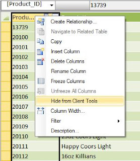
You can hide an entire table: Right Click on the tab for the table, choose "Hide from Client Tools"
You can also hide columns within your tables: Right click on column, choose "Hide from Client Tools"
Create Calculations
For ONE of my data sets, I create two calculations using a DAX formula to sum the data from the two data sets. (Even though a column or table may be hidden from view, it can still be used in your DAX formulas.)
Demo Quantity:=sum(Data_Set_One[Demo_Quantity])+sum(Data_Set_Two[Demo_Quantity])
Demo
Dollars:=sum(Data_Set_One[Demo_Dollars])+sum(Data_Set_Two[Demo_Amount])
Note in my Demo Dollars measure that I am adding my previously and purposely aliased columns called Dollars in one and Amount in the other. Did so to show that so long as you know what you can add together, it doesn't matter much what they are named.
Note in my Demo Dollars measure that I am adding my previously and purposely aliased columns called Dollars in one and Amount in the other. Did so to show that so long as you know what you can add together, it doesn't matter much what they are named.
I have added these two measures to Data_Set_One and hidden all of the other columns:
When completed adding the pivot table to my worksheet, I have a fairly clean looking presentation of information from two
completely different data sources. This gives the recipient the opportunity to slice/dice re-arrange the information based on the common relationships to time, date, location, etc...
Notice there is only one displayed data set with two calculated measure: Dollars and Quantity.
When I first delivered a real example of this, I did so to in an attempt to demonstrate the challenge of trying to provide the business measure based on what they were asking for. My hope was that although I could deliver what was being asked for, I didn't think that it would satisfy the question being asked. In one system the order mode is a reflection of where the product was consumed, the other a reflection of how the order was placed or instructions for preparation. I also wanted an attempt to demonstrate the challenge with our product dimension: both sources of information have the same product ID, but different levels of hierarchy.


No comments:
Post a Comment